MANTRA LABS

  / Mantra.Design

THOMAS
COOKflight

Conceptualizing an unbridled flight

Conceptualizing an unbridled flight

THOMAS
COOK

flight

PROJECT BACKGROUND

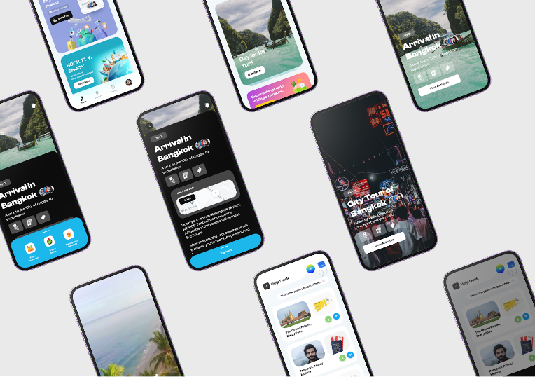
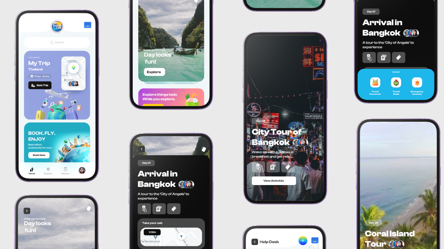
We proposed a new user user experience for Thomas Cook with an immersive and visually appealing interface. Our focus was on creating a seamless and intuitive journey for users.

Mantra Labs conducted detailed UX audits, consumer behavior research, and analysis to develop a revamped digital experience that focused on clarity and engagement

DESIGN Cube
PRINCIPLES

steps

Keep It Simple

Ensuring users are able to easily discover the appropriate information and actionize

Ensuring users are able to easily
discover the appropriate
information and actionize

hourglass

Keep It Focused

Clear value propositions for the target customers

Clear value propositions for the
target customers

engage icon

Keep It Engaging

Optimal usage of the digital real estate available

Optimal usage of the digital
real estate available

BUSINESS GOALS

Thomas Cook wanted to revamp its customer journey across web and mobile applications

Our design and messaging were focused on

01

Providing clarity in navigation and search features

02

Building account dashboards, community spaces and various functionalities for user engagement

03

A comprehensive layout and modern design theme for better customer retention

case study case study
case study

Previous

arrow arrow
arrow arrow

Next

previous next