Xcode 11 is a fundamental developing tool that includes everything needed to create amazing apps for all Apple platforms. It consists of the latest SDKs for macOS 10.15, iOS 13, iPadOS 13, watchOS 6, and tvOS 13. Xcode 11 includes SwiftUI, a framework that provides views, controls, and layout structures for declaring an app’s UI.
SwiftUI is the latest way to declare user interfaces for an iOS platform and create amazing and dynamic apps faster than ever before. Swift eliminates common programming errors by adopting modern programming patterns. SwiftUI eliminates entire classes of unsafe code and adds great new features to make sharing code across Apple’s platforms even easier.
Variables are always initialized before use.
Arrays and integers are checked for overflow
Memory is automatically managed.
Ability to exclusively access memory guards against many programming mistakes.
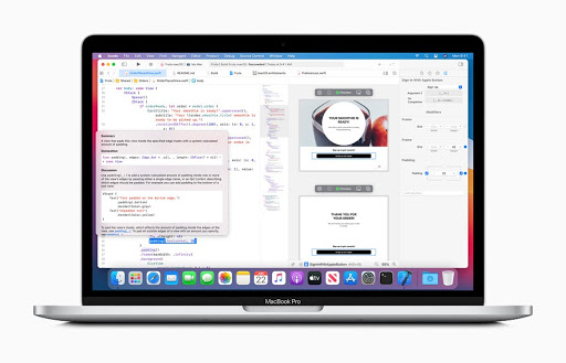
“Swift has been years in the making, and it continues to evolve with new features and capabilities”. At Apple WWDC20 it was mentioned that their goals for Swift are ambitious and that they are eager to see what developers create with it.
SwiftUI introduced developers to a modern UI framework that can help build sophisticated and agile app UIs. Bringing together the global Apple developer community of more than 23 million in a phenomenal and virtual way, Apple announced a plethora of latest enhancements in the swift programming language.
Latest Enhancements in SwiftUI
1. Redesigned widgets
With redesigned widgets on the Home Screen pages, users can experience the developer’s widget every time they look at their device. With new extensions to the SwiftUI API, developers can use the same code to build a widget for iOS, iPadOS, and macOS simultaneously. SwiftUI can be used to create custom complications for WatchOS.
2. Easy Sharing
Swift Package Manager enables easy sharing of Asset Catalog bundles and localizations. .matchedGeometryEffect to provide fluid animations inside of a grid of UI elements. Custom fonts shall automatically scale with dynamic type changes.
3. Extended Use Cases
New open-source packages have been introduced for Numerics, ArgumentParser, and System making Swift a great language for more use cases. It will be able to support basic math functions as well as complex numbers.
4. App-structure APIs
SwiftUI now contains app-structure APIs for all Apple platforms, e.g. @main, @SceneBuilder, Settings etc and WindowGroup to manage windows platform independently.
5. Extended SwiftUI Capabilities
Now developers can write an entire app in SwiftUI using the life cycle API and share it across all Apple platforms. struct BookClubApp: App
6. Simplified App Upgrade
Developers already working with swift can now easily add features to their existing code. Lazy API (Lazy[V|H]Stack) can be used to reduce memory footprint and offer smooth navigation for enormous amounts of data.
In the world of product design, consistency is the cornerstone of delivering a seamless user experience. As digital products evolve and scale, the challenge of maintaining design consistency across multiple platforms, teams, and touchpoints becomes more complex. This is where design systems come in. A design system is a comprehensive set of guidelines, components, and tools that help designers and developers create a consistent and cohesive user interface (UI) and user experience (UX). From a designer’s perspective, building and maintaining a design system requires a strategic approach to ensure scalability, flexibility, and alignment with business goals.
Why Design Systems Matter?
Design systems are more than just style guides or pattern libraries. They offer a unified language for design and development, bridging the gap between creativity and functionality. Here are a few reasons why they are critical:
Consistency Across Products
One of the primary goals of a design system is to ensure uniformity across different platforms and devices. When users interact with a product, whether on a website or a mobile app, they expect a consistent experience. A well-implemented design system ensures that visual elements, interactions, and behaviors are aligned, offering a familiar and intuitive experience for users.
2. Faster Iteration
With a design system in place, teams can reuse components and patterns rather than reinventing the wheel for each new feature. This speeds up the design and development process, allowing teams to focus on solving new problems instead of reworking existing designs. For designers, it means less time spent on repetitive tasks and more time dedicated to innovation.
3. Scalability
As products grow and new features are added, maintaining a coherent UI/UX without a design system can become chaotic. A design system provides a scalable framework, enabling teams to add new elements or modules without compromising the overall consistency of the product.
4. Improved Collaboration
A design system fosters collaboration between designers, developers, and other stakeholders by providing a shared language and reference point. This ensures that design decisions are communicated effectively, reducing friction and misunderstandings between teams.
Building a Design System: A Designer’s Perspective
Designing a system from scratch can seem like a daunting task, but with a clear roadmap and understanding of core principles, it becomes a powerful tool for creating scalable and user-centered products.
1. Define the Core Principles
Before diving into visual components, it’s essential to establish the core principles of your design system. These principles serve as the foundation and guide decision-making throughout the process. Ask yourself:
• What are the key values of your brand?
• How should the design reflect the needs and emotions of users?
• What goals are you trying to achieve with your design system (e.g., accessibility, flexibility, innovation)?
For instance, if accessibility is a top priority, you’ll need to ensure that your design system accommodates users with different abilities, by providing color contrast guidelines, clear typographic hierarchies, and accessible components.
2. Create a Unified Visual Language
Once the principles are established, the next step is creating a cohesive visual language. This includes defining elements such as:
• Color Palette: A well-structured color palette ensures harmony across different UI components. It’s crucial to include primary, secondary, and accent colors, along with usage guidelines to avoid inconsistency.
• Typography: Define a typography system that establishes hierarchies and clarity, including font styles, sizes, line heights, and spacing. Consistent typography helps users navigate content effortlessly.
• Spacing and Grids: An established grid system ensures a balanced layout and harmony between different UI elements. Proper spacing guidelines prevent crowded or misaligned components.
• Iconography and Illustrations: Design guidelines for icons and illustrations help maintain visual consistency. Icons should follow a standard style (outlined, filled) and size, ensuring they align with the overall visual language.
(I
Iconography and Illustrations: Design guidelines for icons and illustrations help maintain visual consistency. Icons should follow a standard style (outlined, filled) and size, ensuring they align with the overall visual language.
3. Design Reusable Components
A design system is incomplete without reusable UI components. These components include buttons, forms, modals, and navigation elements that can be used across various features and pages. Each component should be:
• Modular: Components should be flexible and adaptable for different contexts. For example, a button should have variations for different states (hover, active, disabled) and types (primary, secondary, destructive).
• Documented: Each component needs comprehensive documentation that explains how it should be used, its variants, and the rules governing its application. This ensures consistency when different team members use the same component.
4. Implement Accessibility Guidelines
Accessibility should be at the forefront of every design system. As a designer, consider:
• Color Contrast: Ensure sufficient contrast between text and background for readability.
• Keyboard Navigation: Ensure that interactive components are navigable via keyboard for users who rely on keyboard shortcuts.
• Responsive Design: Components should be responsive, adapting seamlessly across different screen sizes and devices.
• Assistive Technologies: Design components should be compatible with screen readers and other assistive technologies to provide an inclusive experience.
Maintaining a Design System: Evolving with the Product
Once a design system is in place, the work doesn’t stop there. Maintaining it requires ongoing effort as the product evolves and new design challenges emerge. Here’s how designers can ensure the design system remains relevant and effective:
1. Regular Audits and Updates
A design system should be treated as a living document that evolves with the product. Regular audits are necessary to identify outdated or unused components. Designers should collaborate with developers to ensure new features are aligned with the existing design system, and updates should be documented to avoid fragmentation.
2. Version Control and Documentation
Version control is essential for keeping track of changes in the design system. Documenting why and how changes are made ensures that the design system grows in an organized manner. It also helps onboard new team members quickly, as they can reference updated guidelines.
3. Foster Collaboration Across Teams
Designers need to maintain an open line of communication with developers and other teams using the design system. Tools like Figma, Sketch, and Zeplin allow designers to share components and guidelines in real-time, fostering collaboration and ensuring that everyone is aligned.
Some well-known examples of design systems that have set benchmarks in the industry:
Overview: Google’s Material Design is one of the most comprehensive design systems available. It provides guidelines on how to create visual, motion, and interaction design across platforms and devices. Material Design is known for its grid-based layouts, responsive animations, and depth effects like shadows and lighting.
Features:
Comprehensive color palettes, typography, and iconography.
Overview: Salesforce’s Lightning Design System provides a comprehensive library of UI components and resources to help build applications on the Salesforce platform. It ensures a consistent experience across Salesforce products and enables developers to create custom apps easily.
Features:
Ready-to-use components, design tokens, and code snippets.
Comprehensive accessibility guidelines to ensure inclusivity.
Detailed documentation for developers to integrate components into Salesforce applications.
Overview: Fluent Design is Microsoft’s design system, created to provide an engaging and scalable UI across all Microsoft products. It is heavily focused on interaction, animation, and motion while ensuring accessibility across various device ecosystems.
Features:
Focus on depth, motion, and light to create modern and interactive UIs.
Cross-platform components supporting web, desktop, and mobile applications.
Accessible components with detailed guidelines for developers.
Conclusion
Building and maintaining a design system is an investment that pays off in the long run. It ensures consistency across your product, improves collaboration between teams, and allows for faster iteration and scalability. For designers, a design system is more than a collection of reusable components — it’s a framework that enables you to create user-centric products with confidence and clarity. By embracing modularity, documentation, and accessibility, you’ll ensure that your design system remains a valuable asset as your product grows.
About the Author:
Shristi is a creative professional with a passion for visual storytelling. She recently transitioned from the world of video and motion graphics to the exciting field of product design at Mantra Labs. When she’s not designing, she enjoys watching movies, traveling, and sharing her experiences through vlogs.
Knowledge thats worth delivered in your inbox
Next Post
Loading More Posts
Connect with Us!
Thanks for reaching out
Our Sales Team will be in touch with you shortly.
Hello Stranger! Please fill in a few details,and you’ll receive a link to this case study.