Try : Insurtech, Application Development

AgriTech(1)

Augmented Reality(20)

Clean Tech(8)

Customer Journey(17)

Design(43)

Solar Industry(8)

User Experience(66)

Edtech(10)

Events(34)

HR Tech(3)

Interviews(10)

Life@mantra(11)

Logistics(5)

Strategy(18)

Testing(9)

Android(48)

Backend(32)

Dev Ops(11)

Enterprise Solution(29)

Technology Modernization(7)

Frontend(29)

iOS(43)

Javascript(15)

AI in Insurance(38)

Insurtech(66)

Product Innovation(57)

Solutions(22)

E-health(12)

HealthTech(24)

mHealth(5)

Telehealth Care(4)

Telemedicine(5)

Artificial Intelligence(143)

Bitcoin(8)

Blockchain(19)

Cognitive Computing(7)

Computer Vision(8)

Data Science(19)

FinTech(51)

Banking(7)

Intelligent Automation(27)

Machine Learning(47)

Natural Language Processing(14)

expand Menu Filters

Five Principles You Need To Know For Creating Better User Experience

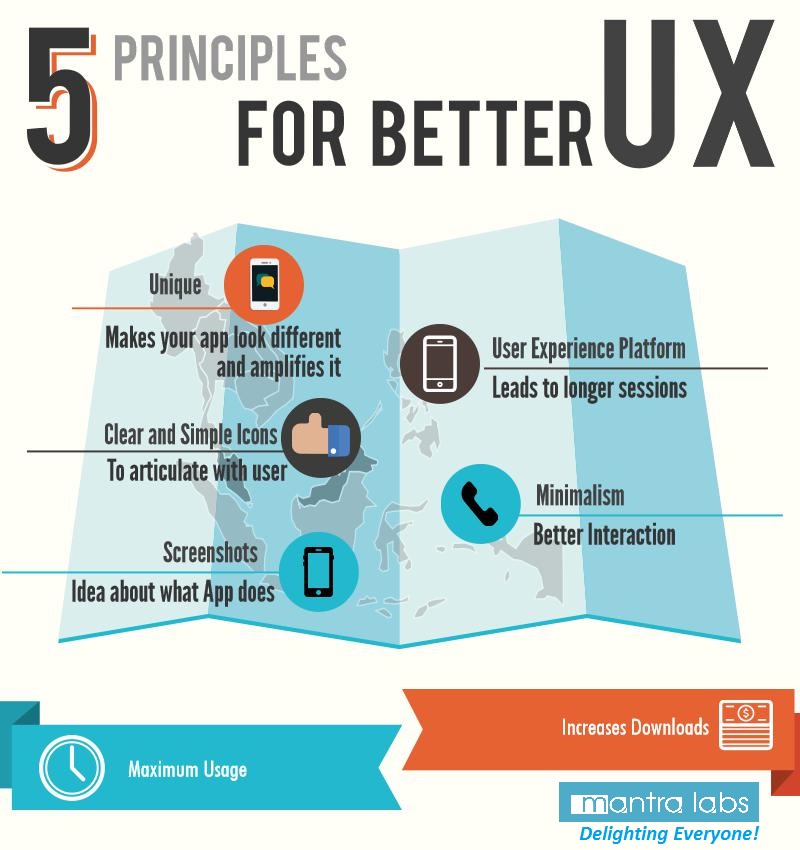
The success of an app depends on the user’s experience and creating a good mobile user experience depends on good UI and performance of an app. To delight users of an app, the designer needs to take into consideration five major points while designing for the perfect execution of UX fundamentals.

    1. Be Unique, Charming and ConsiderateBe Unique: Know what makes your app different and amplify it. There are lots of mobile apps and if there’s nothing special about your app, why would anyone download it? So beforehand, plan an image of what you are going to create and what would be the uniqueness in your design that would attract users.untitled-infographic_block_1 Be charming: Mobile devices are intensely personal. They are our constant companions. Apps that are friendly, reliable and fun are always delightful to use, and people will become quite attached to the experience. So, the designer needs to keep in mind what should be put while creating a UI that will charm user of an app. Be considerate: App developers too often focus on what would be fun to develop and while developing an app, they put their own mental perception in an app or their personal business goals. These are good places to start, but you have to put yourself in your user’s shoes if you ever hope to create an engaging experience.
    2. User Experience Platform
      To begin to think from the perspective of our users, we need to consider three major mobile contexts: Bored, Busy and Lost.Bored: There are a lot of people using their smartphones on the couch at home. The impressive and delightful experiences would gear towards a longer usage session to overcome boredom. Still, there would be interruptions more often while using an app, so be sure your app can pick up where your user left off. Examples: Facebook, Twitter, Angry Birds, web browser.Busy: The ability to accomplish micro-tasks quickly and reliably with one hand in a hectic environment is critical. Remember that the user would have other tasks to accomplish and will have less time to concentrate, so huge targets and bold design are important. Examples: TripIt, email, calendar, banking.Lost: Users who are in transit or in familiar surroundings, but interested in something unknown, sketchy connectivity and battery life are big concerns. You should offer some level of offline support and be sparing with your use of geolocation and other battery hogs. Typical examples: Maps, Yelp, Foursquare.
    3. Use Clear and Simple Icons
      A picture is worth 1,000 words, and a visual interface icon is worth 10,000 lines of code. When designing a mobile app, create simple icons that articulate with the user and help users to achieve better experience. For example, you could use a checkmark to indicate that a task has been completed, a heart to show that something has been selected as a user’s favourite, or the familiar volume iconography to indicate when the sound has been turned on or off. Icons take up less space than the text and would be required to explain a function, giving you more room on screen.
    4. Minimalism


ux


As a designer, you need to keep in mind what would bring better user experience. The best way to increase better user experience is by reducing or removing unnecessary clutter, overbearing features and elements that come with drawbacks.
Rather than adding confusing elements that would cause an interaction mess, instead of that build an app that does one or two things extraordinarily well, with better options or features that are absolutely required to get the job done. This simplicity will help the user to focus on the purpose and effectiveness of your app, making it functional for users of all skill levels.

5.Screenshots
Clear and crisp screenshots would help you when your mobile apps are going up in App stores. With these screenshots user would get an idea about what app does. Yet, if an app performs badly, it will result in poor user experience. If it takes too long to load, crashes regularly, or the central server is down; you can’t fix those problems by fixing the aesthetic appeal of your offering. So, while designing and developing an app, designer and developer both need to take all points into consideration and eliminate elements which will degrade performance and result in the bad user experience.
The design should be easy to understand, which means it should be easier for your neighbour or grandmother to understand. For the most part, photos and digital images should be universally understood.The designer should consider and focus on elements which would reduce text. This will make sure that your app is usable for people of any language, you increase your reach exponentially—something that should make both your development team and potential users happy.


Cancel

Knowledge thats worth delivered in your inbox

Why Netflix Broke Itself: Was It Success Rewritten Through Platform Engineering?

By :

Let’s take a trip back in time—2008. Netflix was nothing like the media juggernaut it is today. Back then, they were a DVD-rental-by-mail service trying to go digital. But here’s the kicker: they hit a major pitfall. The internet was booming, and people were binge-watching shows like never before, but Netflix’s infrastructure couldn’t handle the load. Their single, massive system—what techies call a “monolith”—was creaking under pressure. Slow load times and buffering wheels plagued the experience, a nightmare for any platform or app development company trying to scale

That’s when Netflix decided to do something wild—they broke their monolith into smaller pieces. It was microservices, the tech equivalent of turning one giant pizza into bite-sized slices. Instead of one colossal system doing everything from streaming to recommendations, each piece of Netflix’s architecture became a specialist—one service handled streaming, another handled recommendations, another managed user data, and so on.

But microservices alone weren’t enough. What if one slice of pizza burns? Would the rest of the meal be ruined? Netflix wasn’t about to let a burnt crust take down the whole operation. That’s when they introduced the Circuit Breaker Pattern—just like a home electrical circuit that prevents a total blackout when one fuse blows. Their famous Hystrix tool allowed services to fail without taking down the entire platform. 

Fast-forward to today: Netflix isn’t just serving you movie marathons, it’s a digital powerhouse, an icon in platform engineering; it’s deploying new code thousands of times per day without breaking a sweat. They handle 208 million subscribers streaming over 1 billion hours of content every week. Trends in Platform engineering transformed Netflix into an application dev platform with self-service capabilities, supporting app developers and fostering a culture of continuous deployment.

Did Netflix bring order to chaos?

Netflix didn’t just solve its own problem. They blazed the trail for a movement: platform engineering. Now, every company wants a piece of that action. What Netflix did was essentially build an internal platform that developers could innovate without dealing with infrastructure headaches, a dream scenario for any application developer or app development company seeking seamless workflows.

And it’s not just for the big players like Netflix anymore. Across industries, companies are using platform engineering to create Internal Developer Platforms (IDPs)—one-stop shops for mobile application developers to create, test, and deploy apps without waiting on traditional IT. According to Gartner, 80% of organizations will adopt platform engineering by 2025 because it makes everything faster and more efficient, a game-changer for any mobile app developer or development software firm.

All anybody has to do is to make sure the tools are actually connected and working together. To make the most of it. That’s where modern trends like self-service platforms and composable architectures come in. You build, you scale, you innovate.achieving what mobile app dev and web-based development needs And all without breaking a sweat.

Source: getport.io

Is Mantra Labs Redefining Platform Engineering?

We didn’t just learn from Netflix’s playbook; we’re writing our own chapters in platform engineering. One example of this? Our work with one of India’s leading private-sector general insurance companies.

Their existing DevOps system was like Netflix’s old monolith: complex, clunky, and slowing them down. Multiple teams, diverse workflows, and a lack of standardization were crippling their ability to innovate. Worse yet, they were stuck in a ticket-driven approach, which led to reactive fixes rather than proactive growth. Observability gaps meant they were often solving the wrong problems, without any real insight into what was happening under the hood.

That’s where Mantra Labs stepped in. Mantra Labs brought in the pillars of platform engineering:

Standardization: We unified their workflows, creating a single source of truth for teams across the board.

Customization:  Our tailored platform engineering approach addressed the unique demands of their various application development teams.

Traceability: With better observability tools, they could now track their workflows, giving them real-time insights into system health and potential bottlenecks—an essential feature for web and app development and agile software development.

We didn’t just slap a band-aid on the problem; we overhauled their entire infrastructure. By centralizing infrastructure management and removing the ticket-driven chaos, we gave them a self-service platform—where teams could deploy new code without waiting in line. The results? Faster workflows, better adoption of tools, and an infrastructure ready for future growth.

But we didn’t stop there. We solved the critical observability gaps—providing real-time data that helped the insurance giant avoid potential pitfalls before they happened. With our approach, they no longer had to “hope” that things would go right. They could see it happening in real-time which is a major advantage in cross-platform mobile application development and cloud-based web hosting.

The Future of Platform Engineering: What’s Next?

As we look forward, platform engineering will continue to drive innovation, enabling companies to build scalable, resilient systems that adapt to future challenges—whether it’s AI-driven automation or self-healing platforms.

If you’re ready to make the leap into platform engineering, Mantra Labs is here to guide you. Whether you’re aiming for smoother workflows, enhanced observability, or scalable infrastructure, we’ve got the tools and expertise to get you there.

Cancel

Knowledge thats worth delivered in your inbox

Loading More Posts ...
Go Top
ml floating chatbot