Insurance instinctively feels old. It’s as though, the fast-moving parts of the digital age can’t seem to permeate its an archaic blueprint. Sure enough, it looks and feels that way too. One look at the spasm of choices to avail insurance online will leave you feeling dull and permanently bored. Consumers often don’t buy insurance, (even when they need it) because they are turned off by the complexity involved in understanding the product itself, and in the way, it is typically packaged & sold.
In the Internet 2.0 era, users switch lightning quick between a dozen websites in tandem. The insurance industry, like most, is largely affected by the seeming lack of leverage they have in understanding what appeals to the consumer’s buying nature, instincts and experience.
The power of ‘choice’ lies in the hands of the insured, while the ability to ‘influence’ choice is a matter of design thinking. So if a user doesn’t get the price, product, service, communication and/or experience — they quickly move on.
Insurers need next-gen customer engagement solutions that enable them to deliver the right interaction or experience at every customer touchpoint across the lifecycle, in order to maximize real customer lifetime value.
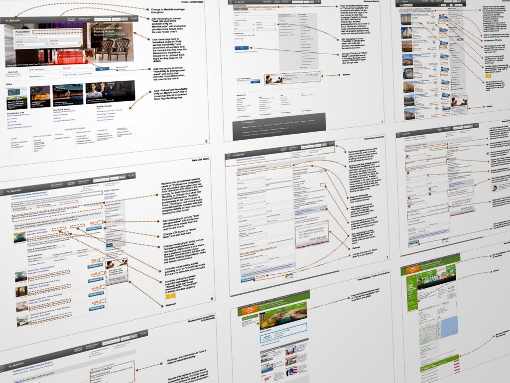
A detailed UX audit reveals many lacklustre areas in traditional insurance websites. In my experience (from having performed countless such audits) — insurance pages create limited awareness of the product, incomplete product understanding, confusion about features, low trust in delivery, frustration about lack of transparency, limited access to easy self-service tools and often a feeling of being overwhelmed leading to a tendency to put-off the purchase.
The inability to correct low engagement among Gen Y and Z users will hurt the long term stability for product innovation. According to a recent McKinsey analysis, the average number of interactions among banks and big tech cos with their customers (above the age of 20) is between 2100 to 2500 interactions per year. The same for health insurers average only around 270 to 300 interactions each year, perhaps indicating a strong disconnect between the need for insurance as a product/ service and its perception otherwise.
The transition from a ‘policy-centric’ to a ‘customer-first’ approach for up-selling, cross-selling and retention requires designing for three needs — ease of use, choice and (access to) support.
As customer expectations continue to evolve and lower tolerances are built for needlessly long and drawn-out customer journeys, the need for consistently delivering a superior experience stands out.
Let’s take a look at how insurers can improve some key areas of engagement:
- Omnichannel
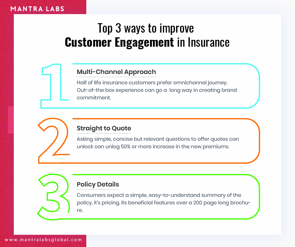
Nearly half of all life insurance customers prefer an omnichannel journey. This means that they expect the same superior experience today through search, social, website, app and in-person interactions with the company, and tomorrow. For creating the ideal ‘target customer journey’, basic pain-points are critical to addressing. For instance, a simple call before a routine health check-up to reassure the customer for any assistance post-appointment can go a long way in reassuring the brand’s commitment to even the finer details. These out-of-the-box experiences facilitate the creation of ‘Signature moments’ for the customer, driving loyalty.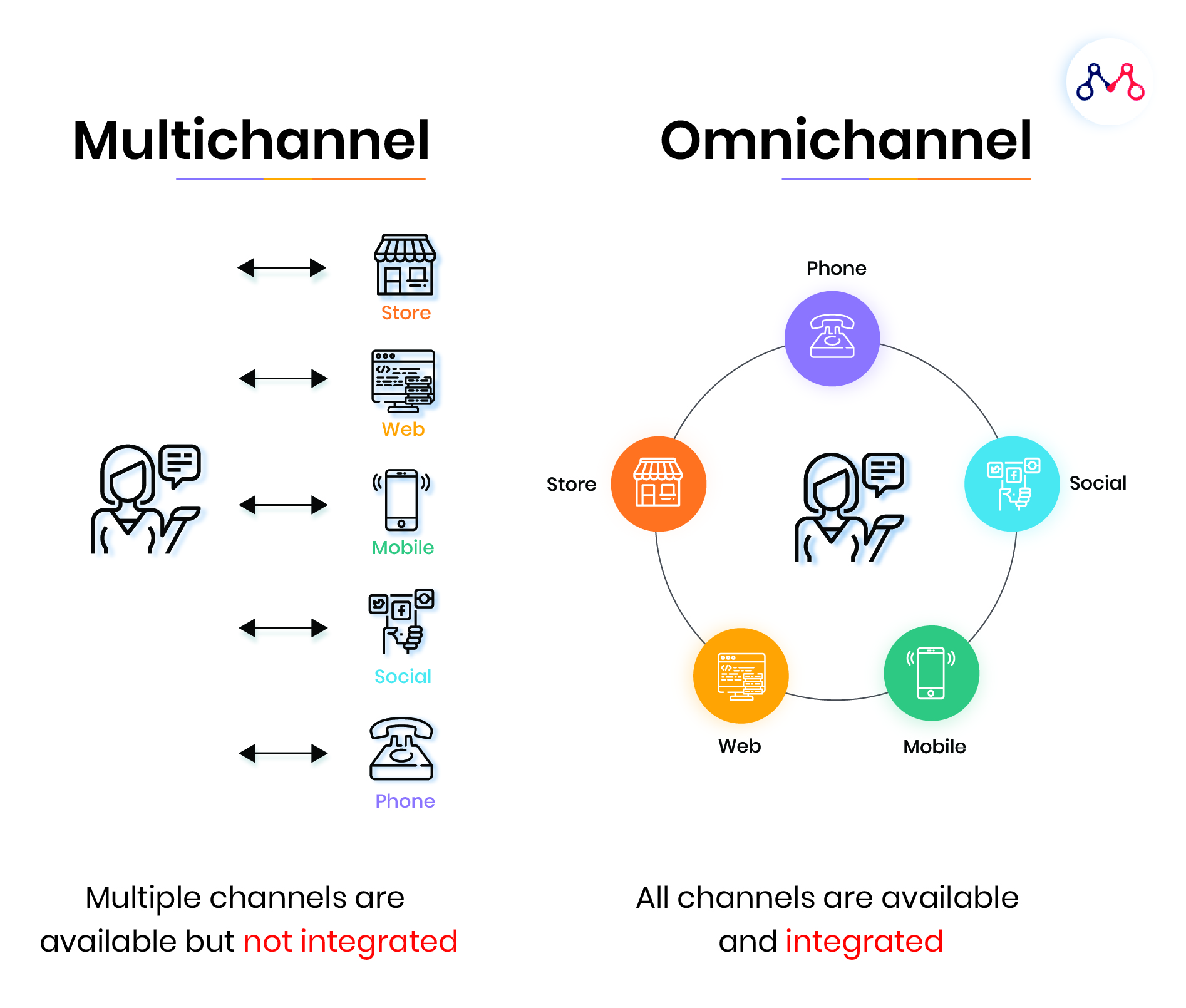
Today, most buying journeys begin with mobile — as people explore their insurance options in their free time, and on the move. Insurers will have to reinvent multichannel experiences like any other consumer product, say designer clothing or high-end electronics. While basic hygiene factors such as a mobile-responsive website equipped with a home-page wizard that seamlessly engages and assists the user are mandatory for companies who wish to increase their conversions, especially among younger demographics. - Straight-to-Quote
Getting to a product quote is one of the first interactions a user engages in. A potential customer checks on average, 4-5 websites before coming to any serious buying decision.
The majority of insurers still use a plain design approach to displaying products — the method of asking the same bundle of questions in a ‘tick-box’ format. Asking less but relevant questions to offer quotes should be seen as a prerequisite in order to let go of outdated buying flows.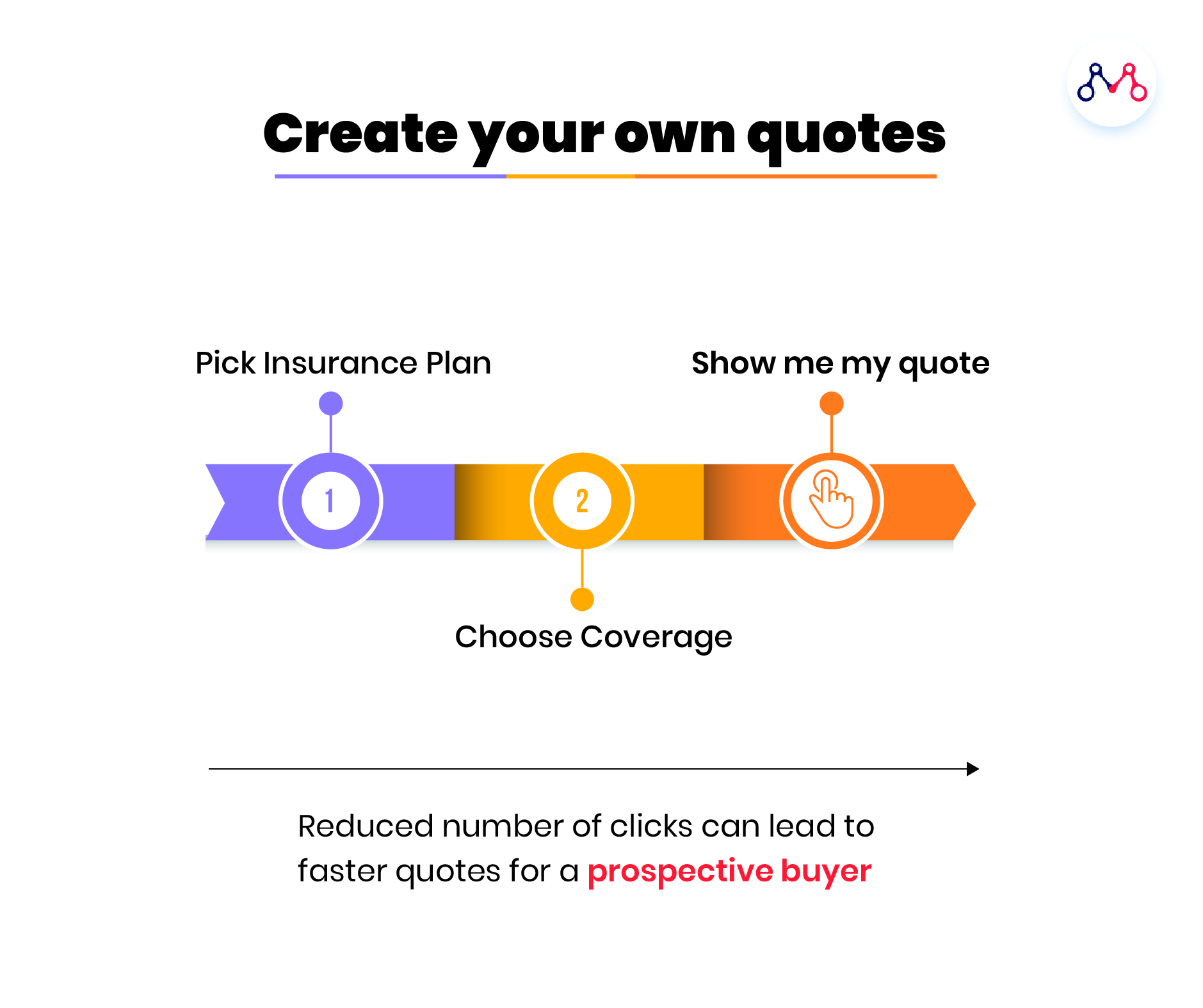
A redesigned process can manufacture simple operational improvements. A prospective buyer who is looking for a quote on an insurer’s website is already spending time researching a multitude of different products with varying features. Insurers can save these users time spent on extensive research, through quick outreach that delivers a sensible buying rationale that feels personal to the user (using data & analytics).
From here, a human agent (who is monitoring the journey thus far) can quickly take over and interactions can move beyond the jargon to address real needs. The user can be led to a more personalized interaction site (instead of being forced to download an app) and can get all account information, policy summaries and main headlines straight to phone or email — without having to re-enter any data.
An overhaul of the journey (such as the one above) can unlock 50% or more increase in new premiums, simply because the customer and the insurer got off on the right page together. - Policy Details
Even in the age of digitalization, prospective customers still prefer to talk to people when it comes to getting information about the cost and quality of insurance products. Hardly anyone reads the 200-page brochure explaining every minute detail of an insurance policy. Users expect a simple, easy-to-understand summary of the policy, it’s pricing, its beneficial features and how it fares better than other policies in the market offered by other insurers.
Aggregators typically overcome this well, because they have to pit multiple policies against each other. In order to achieve this, a streamlined UI needs to be placed at the forefront of the interaction. This can easily navigate users through the buying journey and gather the relevant information along the way.
Lemonade and Insurify are great examples of new-age insurtechs already doing this — by using extensively user-tested pages with simple, clean CTAs strategically positioned along with the page, drawing the users scroll to each next step.
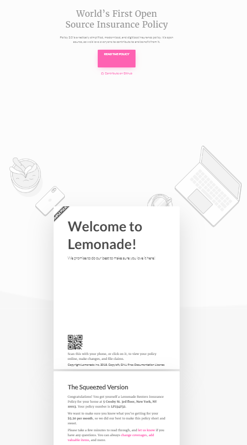
Another approach to disseminating the right policy information at the right time is to demonstrate the utility of the product through simple and effective storytelling. This way, the policy is broken down into easily digestible chunks that are always accessible to the user at any stage of their lifecycle with an insurer and avoids their dependency on legal confusing jargon. Insurers can also allow the user to craft their own policy (eg: lemonade insurance), which allows the user to experience exactly how their coverage works in-and-out.
- Quick Support & Advice
Buying insurance protection is often unplanned and can be an emotional decision — since customers are looking to protect their life, health, home, family, or possessions. The process is usually mired with the hassle of navigating poorly designed experiences that don’t pay attention to an individual’s immediate or future needs but rather focuses on selling a generic product with no unique features. This makes the very idea of designing personalized user experiences extremely modern and a conscious path to the future of ‘individualized selling’. Insurers will have to present an uncluttered, clean, and straight-to-the-point visual website with simple & memorable messaging, and a conversational wizard that gives every user the freedom to explore freely and transition fluently across each stage in the buying process.
Design thinking is all about product innovation for the best customer experience. A customer-first approach has been proven to create better business ROI, that demonstrably improves the customer-company dynamic. The right UX expert can bring an unbiased view into what your customer feels, and point out where the relationship, for insurers, can finally begin to improve.
To know more about how our customer-first design approach is solving insurer challenges across their customer journeys, reach out to us at hello@mantralabsglobal.com.
Knowledge thats worth delivered in your inbox


